
The menu editor is where you arrange artwork, text, prices, and other content on each screen. Its main parts are the screen controls at the top, the editing toolbar above the canvas, the screen canvas in the center, and side panels for artwork and prices.
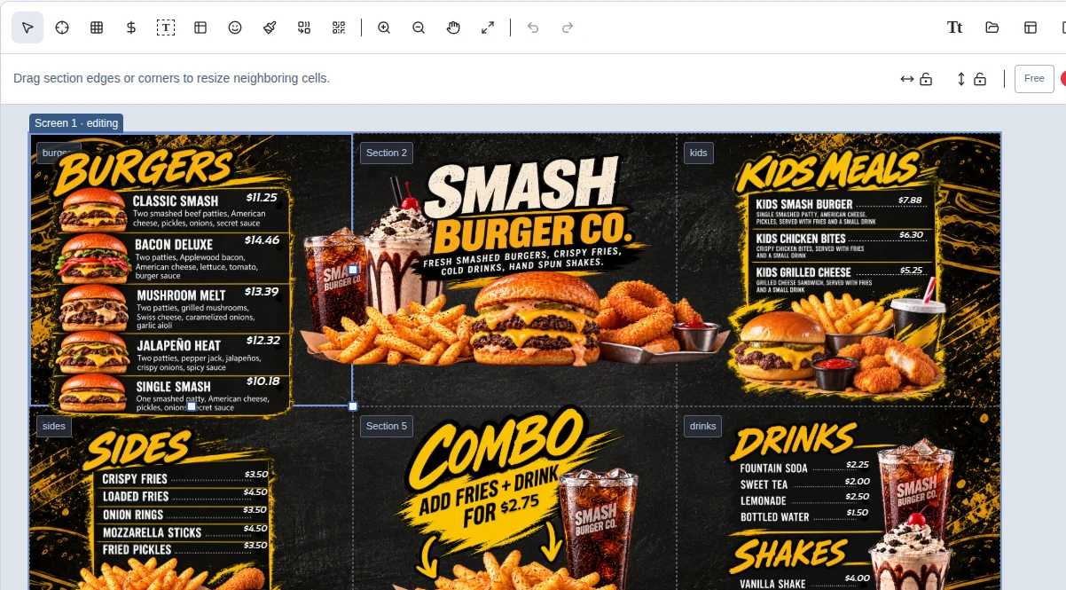
Start with the screen canvas
The canvas is a working view of the selected display screen. Section boundaries divide the screen into areas for content. Choose a screen from the screen selector near the top right to work on another screen. The Screens control in the page header manages how many menu screens you have. The Layout tool above the canvas arranges sections within the selected screen.
Select an item to work with it. Drag it to reposition it; use its visible handles to resize it. When the screen uses a column or grid layout, section boundaries help keep the layout organized. A free placement layout lets sections move and overlap more freely.
Screen controls: layout, workspace, and background
These controls sit at the right end of the editor toolbar. Layout changes the sections on the selected screen. Screen workspace arranges multiple screens together in the editing area. Screen background sets what appears behind that screen's artwork and overlays.
 Screen workspace: choose Single screen to focus on one screen, or Multiple screens to view selected screens together. In Multiple screens mode, choose which screens to show and arrange them side by side, stacked, or in a grid. You can change their order, adjust gaps and offsets, or drag a screen's label on the canvas. These workspace settings are saved for the current location and do not change the menu or player assignments.
 Layout: choose Columns, Grid, or Free placement for sections on the selected screen. Set the number of columns and rows for a grid. Free placement lets sections overlap anywhere on the screen. When you apply a layout, sections keep their cells when possible; if the grid shrinks, sections are arranged into the new cells. Existing artwork and overlays are retained, while empty slots may be removed when shrinking the grid.
 Screen background: choose an image or a solid color for the selected screen. An image sits behind artwork and overlays. Choose Fill screen to cover the screen or Show whole background to keep the full image visible. You can change or re-sync the image, or remove it. Save the draft to keep background changes.
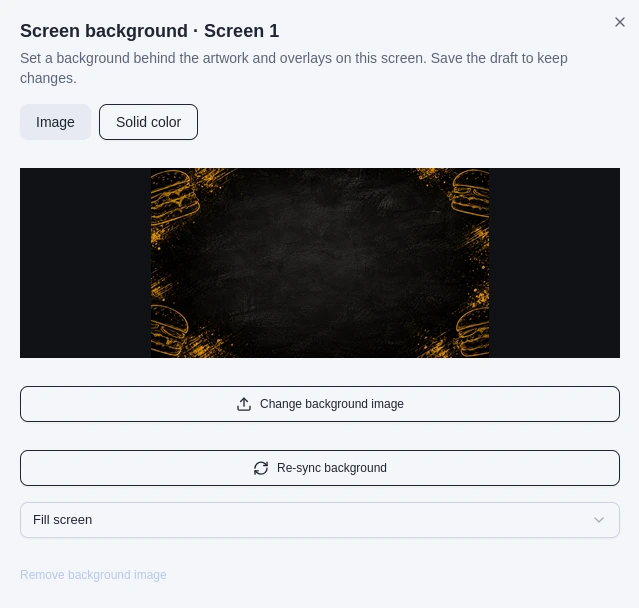
The screen background controls let you choose an image or solid color, set how an image fits, refresh it, or remove it.
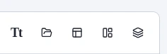
The right end of the toolbar contains the Screen workspace, Layout, and Screen background controls.
Toolbar basics
The toolbar provides tools for selecting and placing content, adjusting the canvas view, and undoing or redoing edits. Each tool's icon is shown below. Hover over an icon in MenuStudio to see its label.
 Select [S]: select an item or section and move it on the canvas.
 Set anchor [A]: switch to anchor mode to add a line or dot guide.
 Show grid: toggle the visual grid on or off while editing.
 Place price [P]: add a price overlay, then enter or choose the price and position it.
 Insert text box [T]: place editable text on the screen.
 Insert table [Shift+T]: add a table when content needs rows and columns.
 Emoji: insert an emoji into text.
 Drawing mode [D]: open drawing tools for creating artwork directly on the screen.
 Merge sections: combine adjacent sections so one image can span a larger area. This is unavailable in free placement layouts.
 QR code generator: create a QR code for the menu.
 Zoom in [Z] and
 Zoom out [Shift+Z]: change the canvas magnification.
 Pan workspace [H]: move around the canvas when you are zoomed in.
 Fit workspace [Shift+Enter]: return to a fitted canvas view; its label also shows the current zoom percentage.
 Undo [Ctrl+Z / Cmd+Z] and
 Redo [Ctrl+Shift+Z / Cmd+Shift+Z]: step backward or forward through recent edits.
Some controls open panels or change the active placement mode. After choosing a placement tool, click the canvas where you want the new item. Press the selection tool when you want to return to selecting and moving existing items.

Place and remove anchors
Choose Set anchor, then drag on the screen to place a line anchor or click to place a dot anchor. Anchors are alignment guides; they do not appear on the published display. To remove one, select the line or dot and press Delete or Backspace.
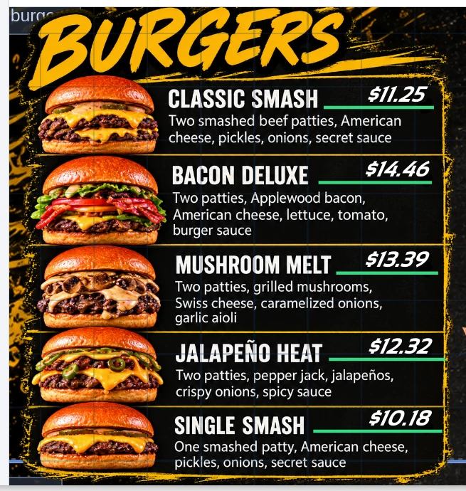
The green lines show line anchors placed beneath prices while the grid is visible.
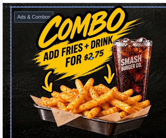
The blue point marks a dot anchor on the combo price.
Add artwork
Use Add image to screen to upload a file or choose artwork already stored in Files. The artwork panel shows the selected section's image content. Choose an image for a section, then arrange it on the canvas. The side panel also provides access to price tools.
Position content neatly
When no item is selected, use the separate Anchor snap and Smart snap switches to choose how snapping works during placement and movement. Anchor snap aligns price and text anchors with guide lines and dots that you added to the screen. Smart snap aligns items with nearby menu content; it can also use the screen edges and center, and visible grid lines. Turn either switch off to skip that kind of alignment. Free is a separate layout option that changes how sections are arranged. In column or grid layouts, drag section boundaries to resize neighboring cells.

Changing a switch does not move or resnap items by itself. The current switch settings apply when you place or drag an item, including one that was already on the screen. With Smart snap on, grid alignment is available when the grid is shown. Free selects the screen's section layout.
For small position adjustments, select an item and use the arrow keys to fine-tune its placement. Zoom in when you need to work on a smaller area, and use the hand tool to move around the enlarged canvas.
Save and preview your work
Choose Save draft to keep your current work in the workspace. Choose Preview to review the menu without editing controls, then return to the editor to make changes. Publishing is a separate action that sends the saved version to players; see Publish your menu for that workflow.